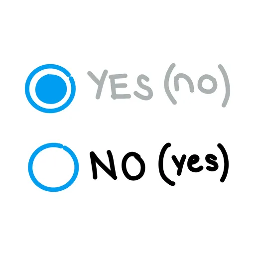
Dark Pattern

A user interface that has been intentionally designed to trick or deceive user activity, wherein they purchase goods or sign-up for an unwanted service.
Origin
UX researcher Harry Brignull, who holds a PhD in cognitive science, coined the term on July 28, 2010 when he registered darkpatterns.org as a pattern library for naming and shaming deceptive user interfaces. The site catalogued tactics such as hidden costs, forced continuity, and trick questions that companies embed in checkout flows and sign-up forms. The concept has since been adopted into law, including the EU Digital Services Act and the California Privacy Rights Act.
Everyday Use
Dark patterns are all around us as intentional means to deceive our decision-making into a particular pathway. They act evil nudges. Everything from trial periods where they'll hope you forget to cancel, to underlying hidden costs of a product that don't arise until the final page of the transaction process, to making it easy to sign up for services but very difficult (even impossible) to delete those services.
Dark patterns are a reminder that not all user experience is synonymous with altruistic user welfare. Sometimes, it's when we are relying on known patterns, trusted relationships, and accepted patterns of behavior that we have to be the most vigilant.